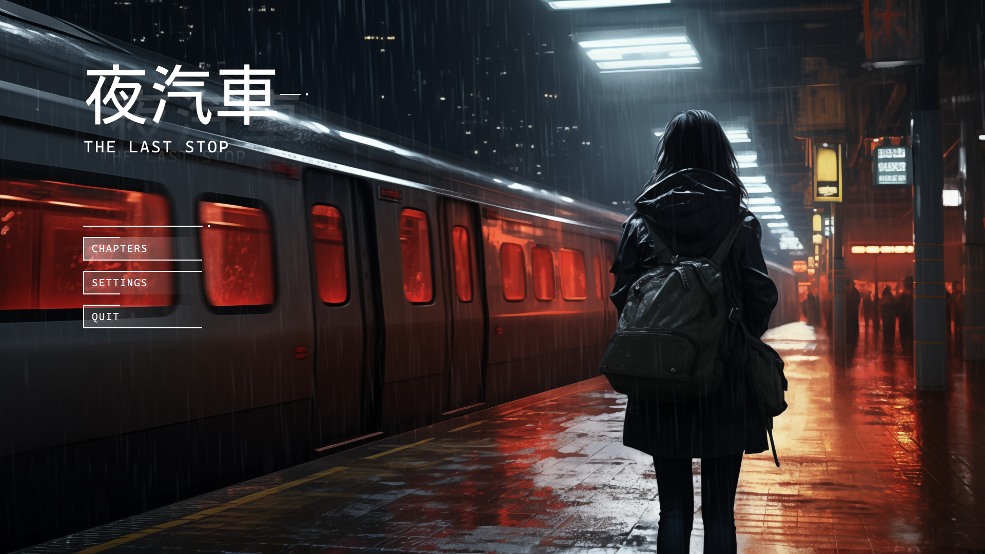
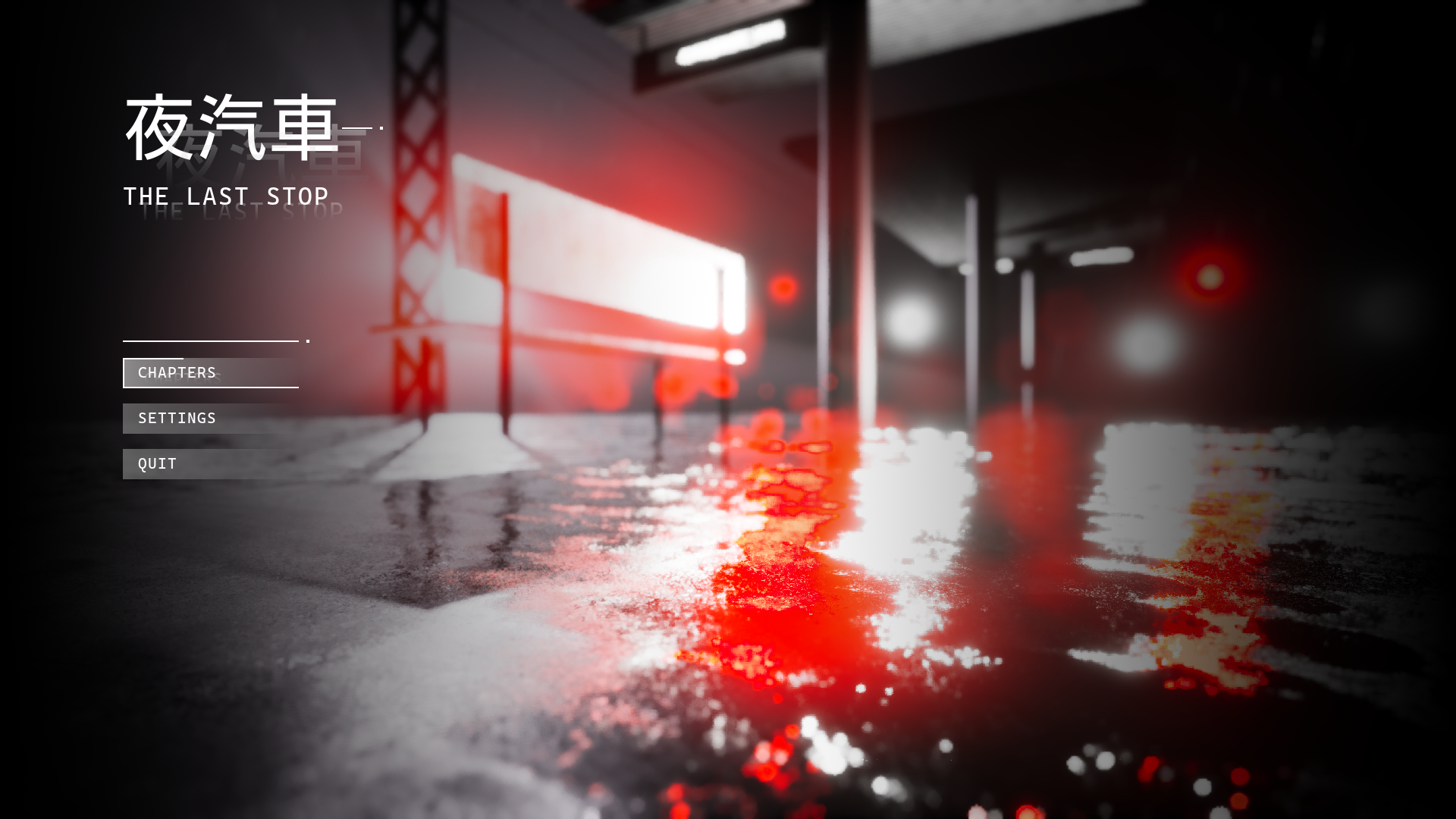
Night Train
the last stop
Intrigue grips you as strange text messages flood your phone after your sister mysteriously vanishes. Determined to unravel the truth, you embark on a haunting journey to Tokyo, entrusting these cryptic messages to guide you to her fate. Will Tokyo's secrets reveal the chilling reality behind her disappearance?
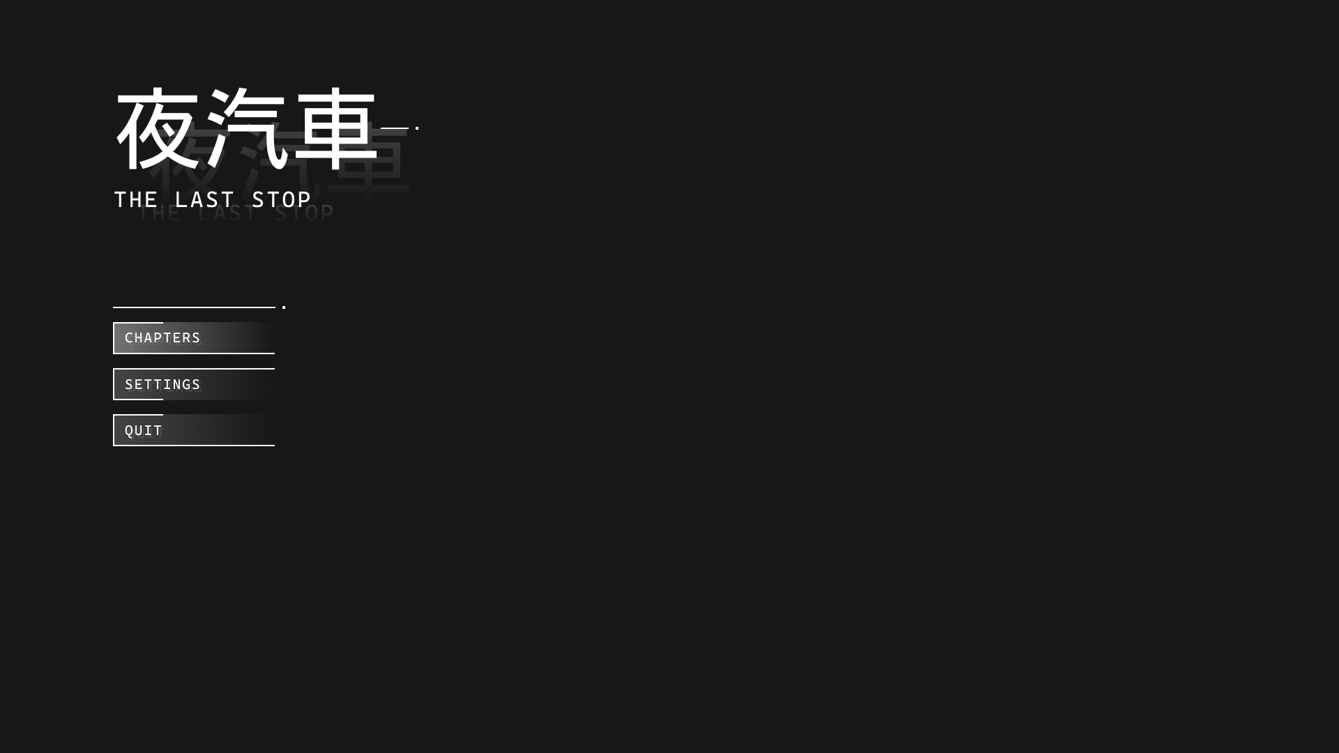
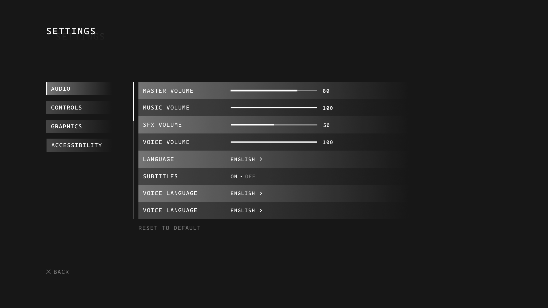
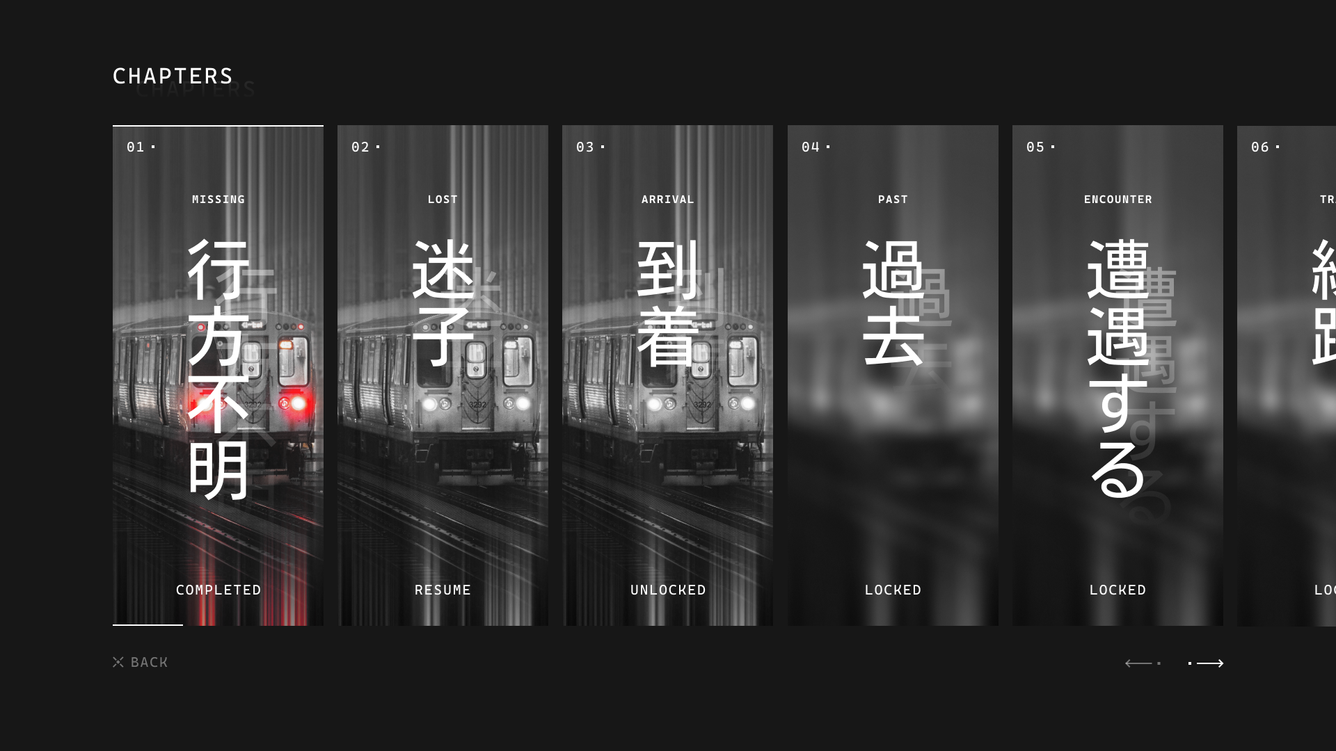
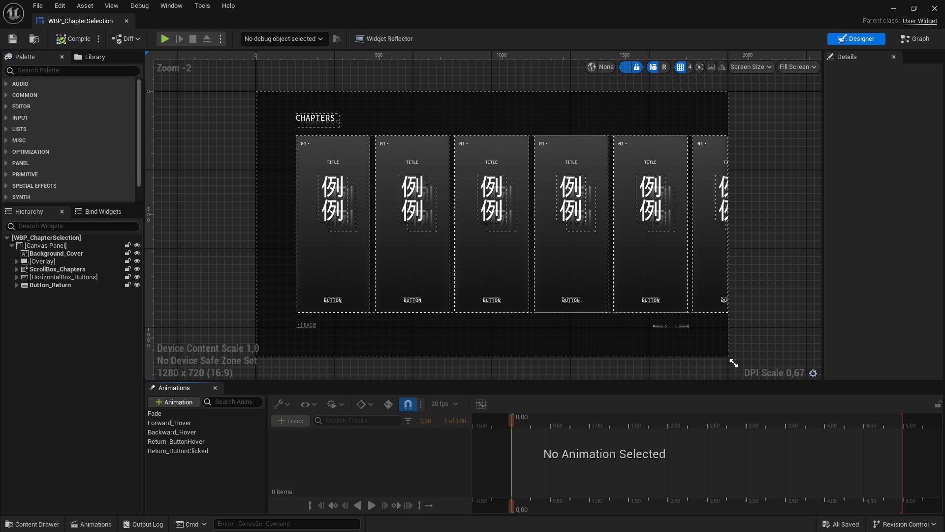
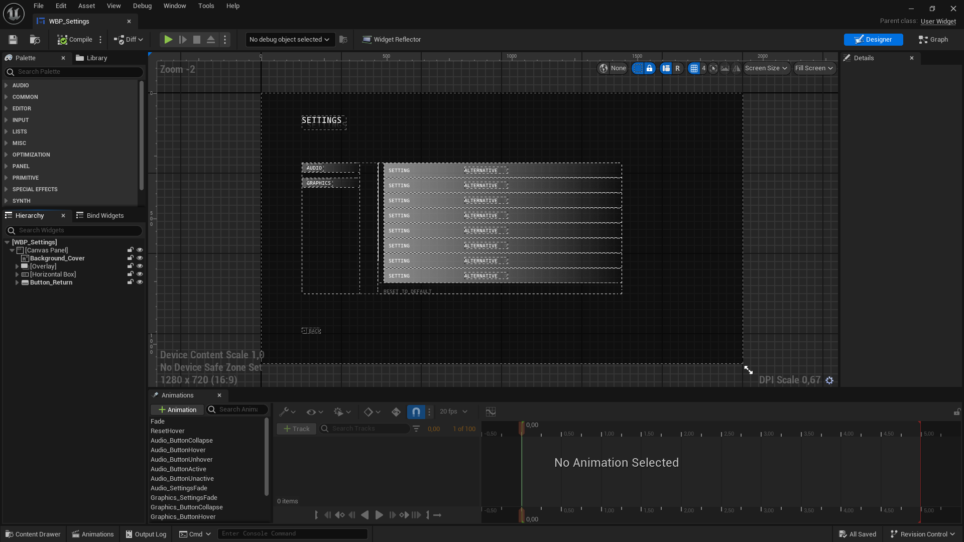
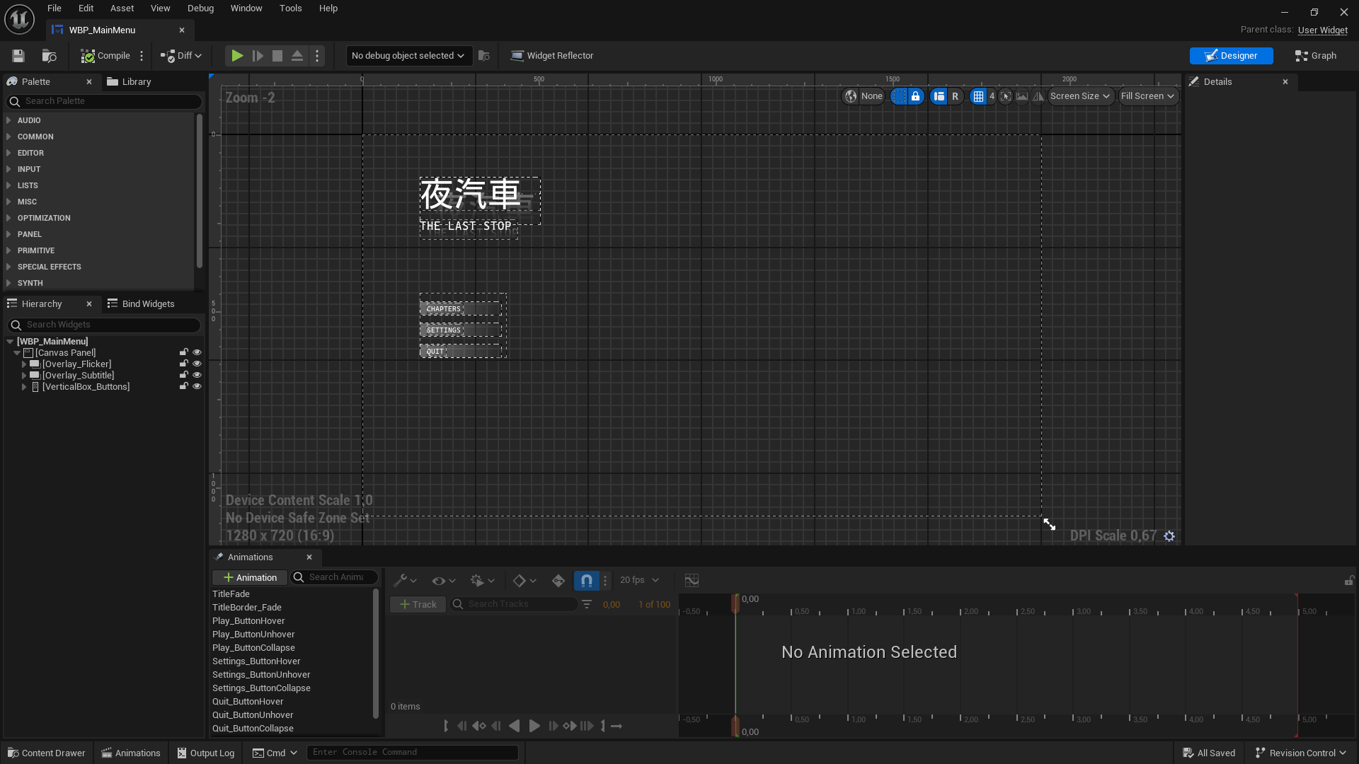
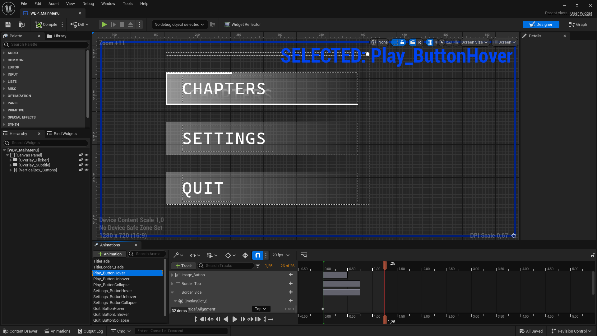
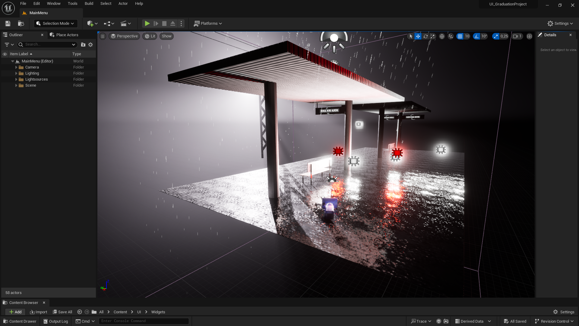
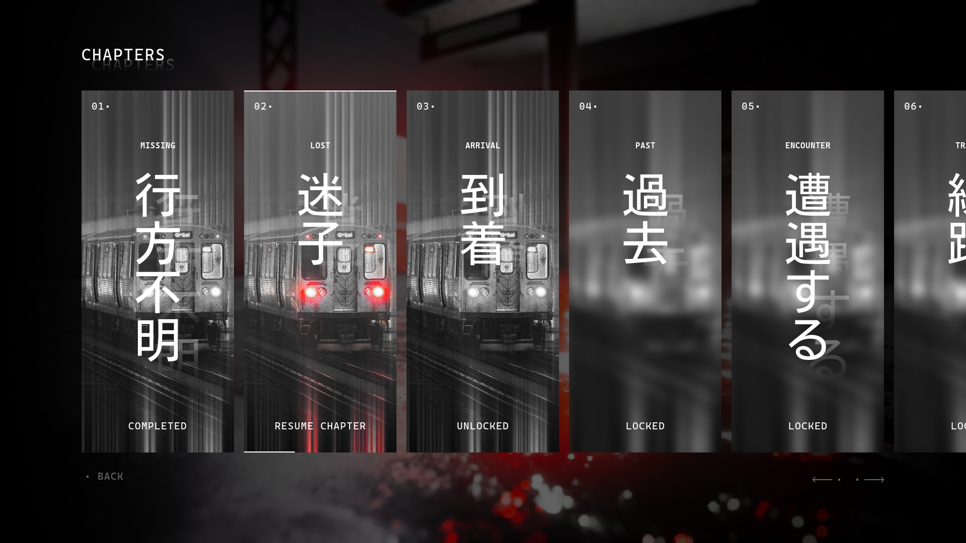
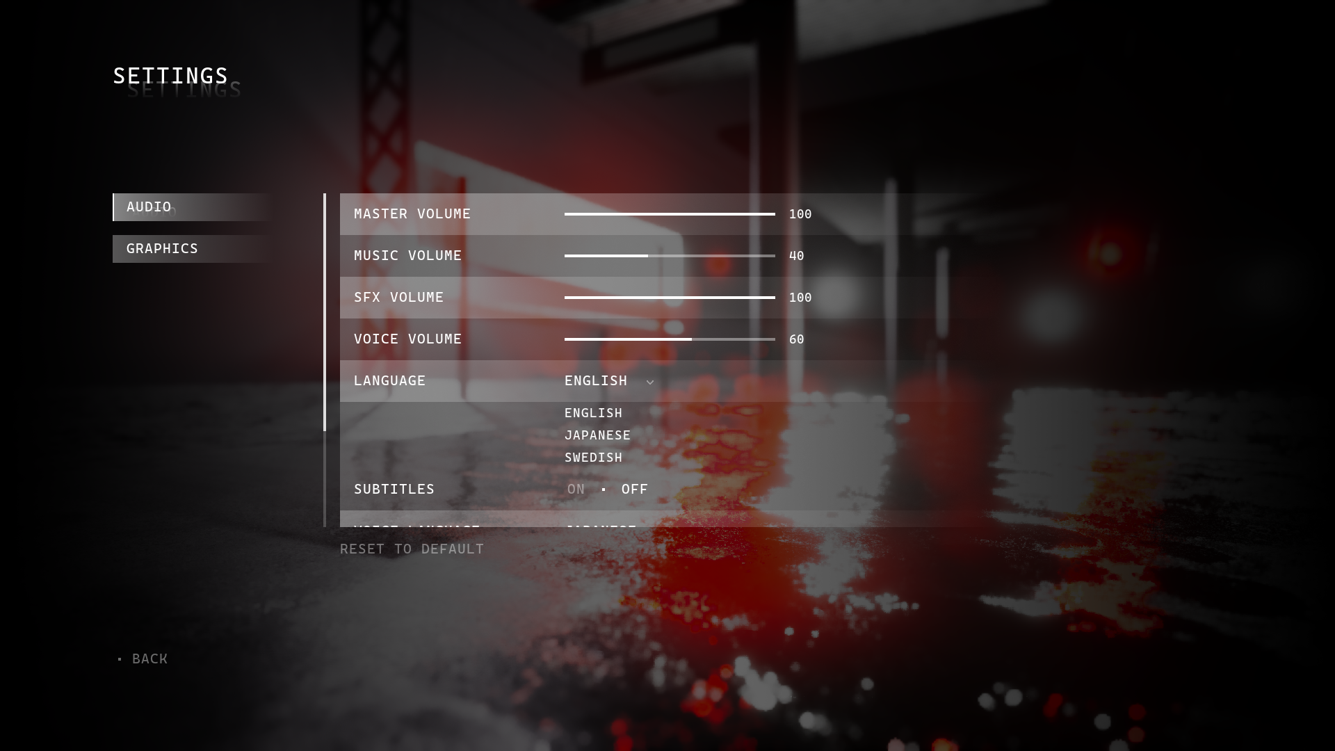
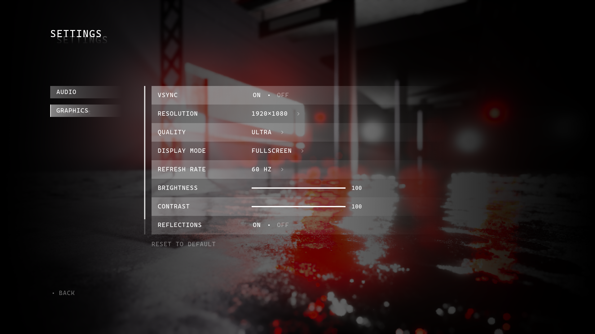
UI Design
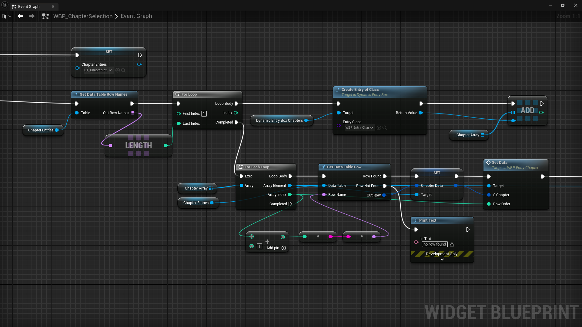
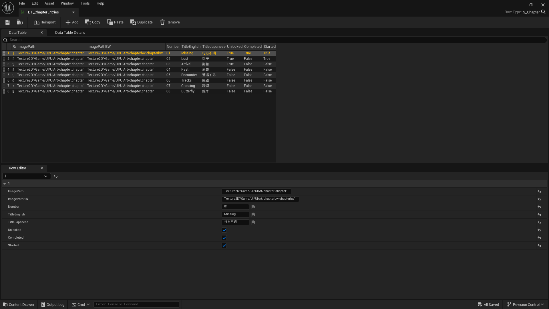
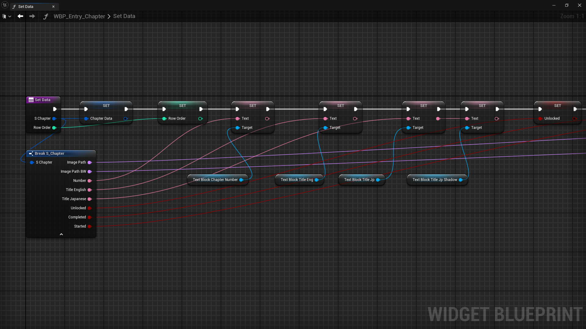
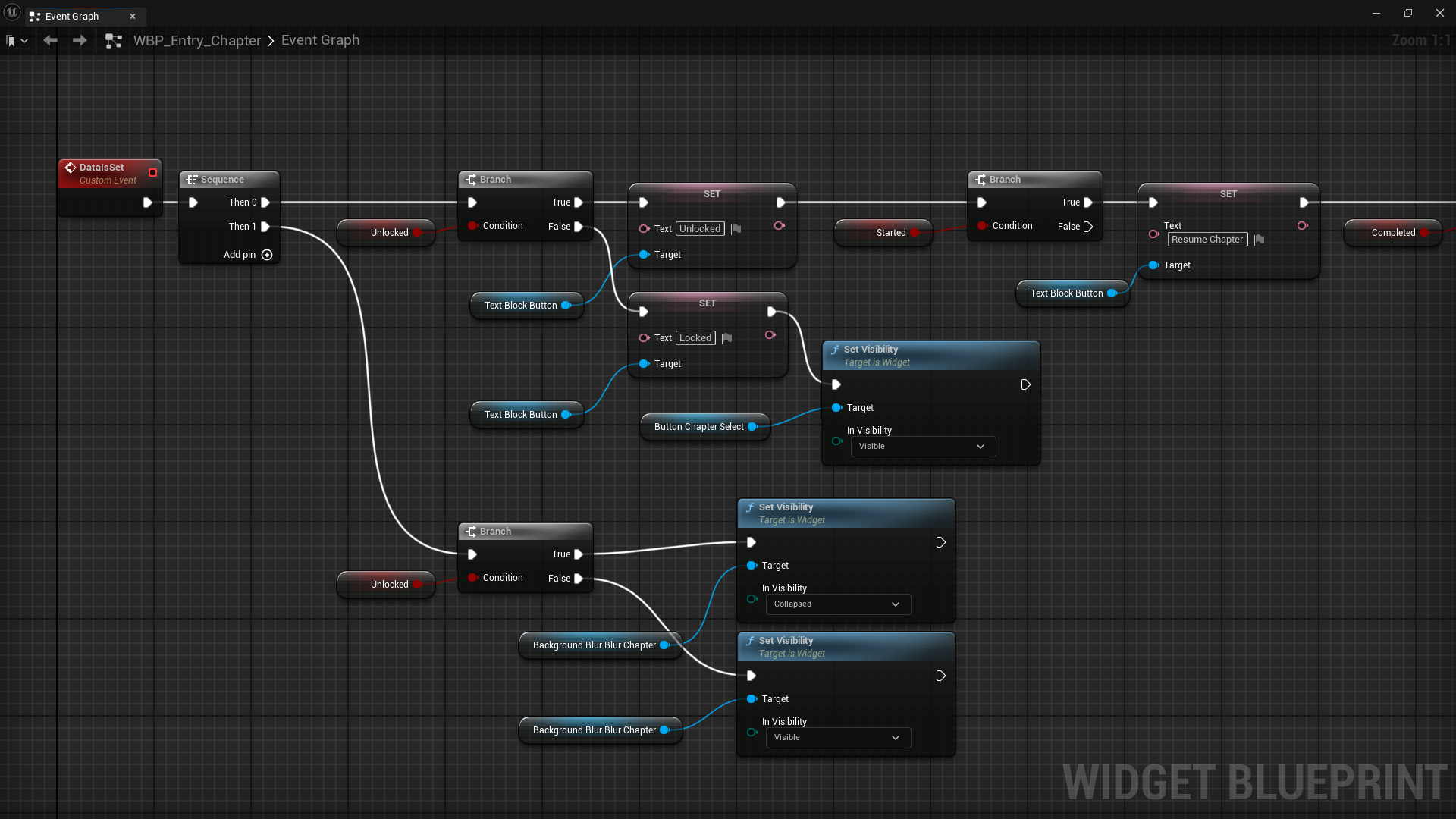
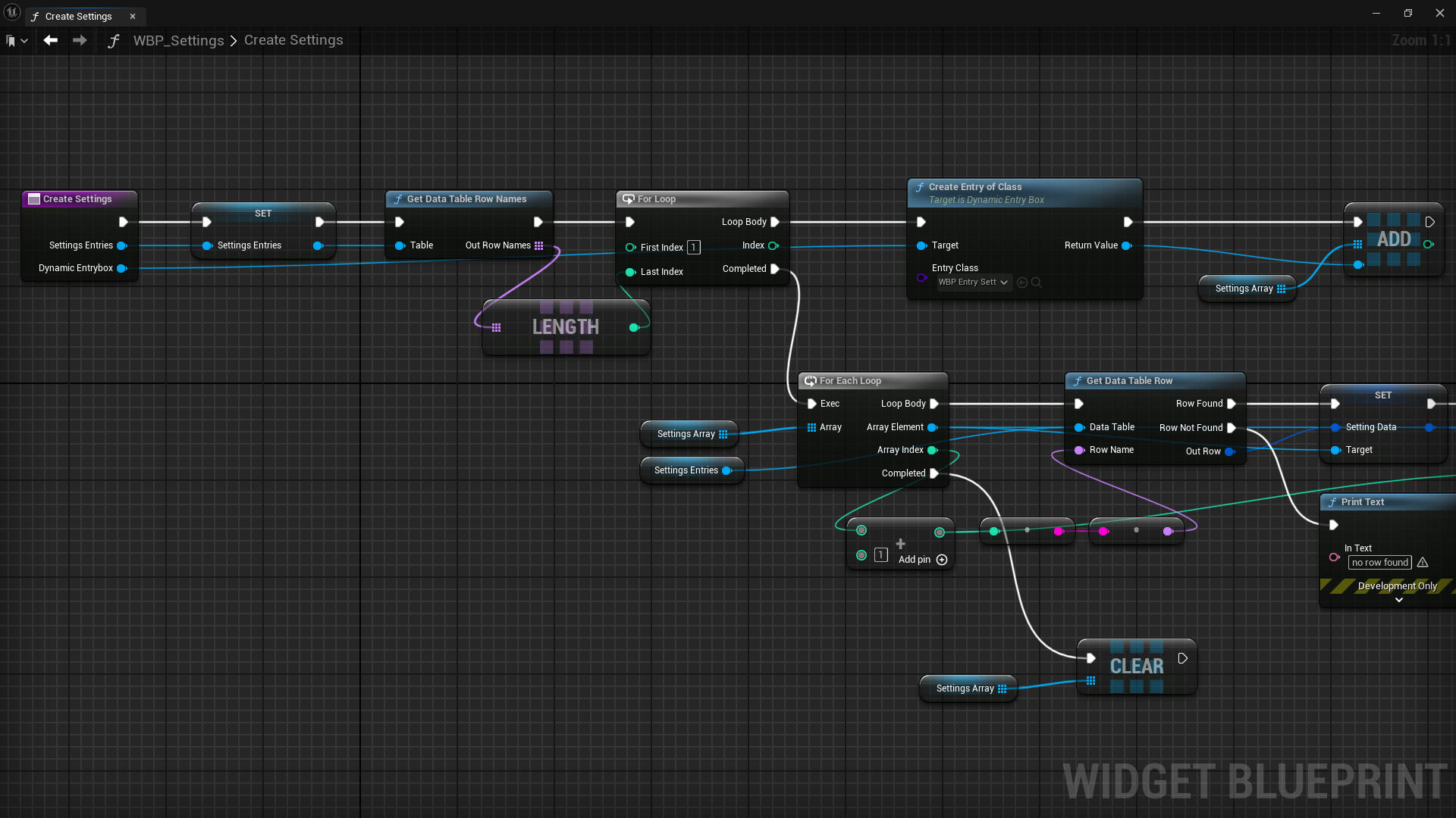
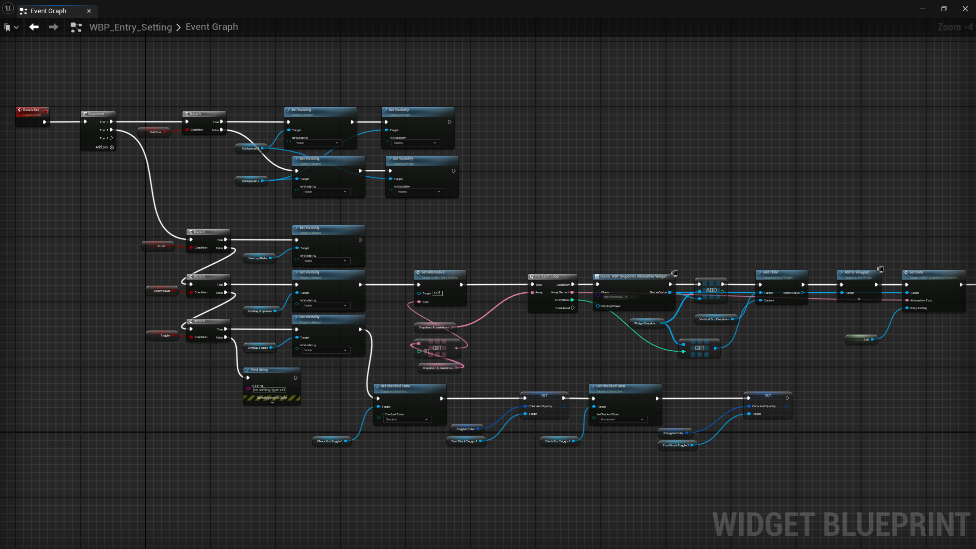
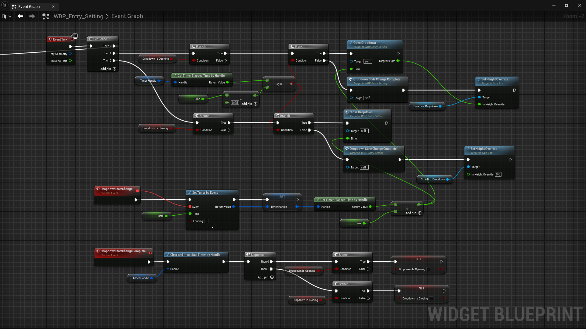
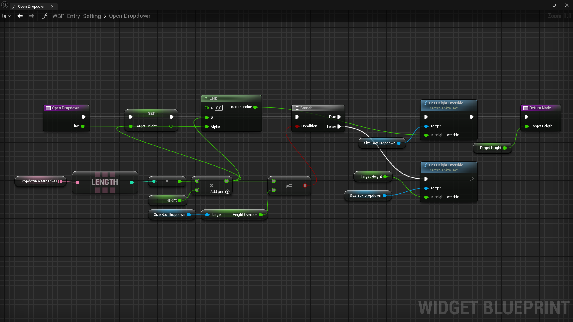
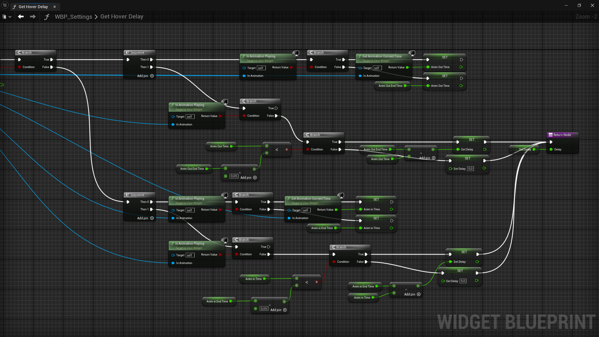
Technical UI
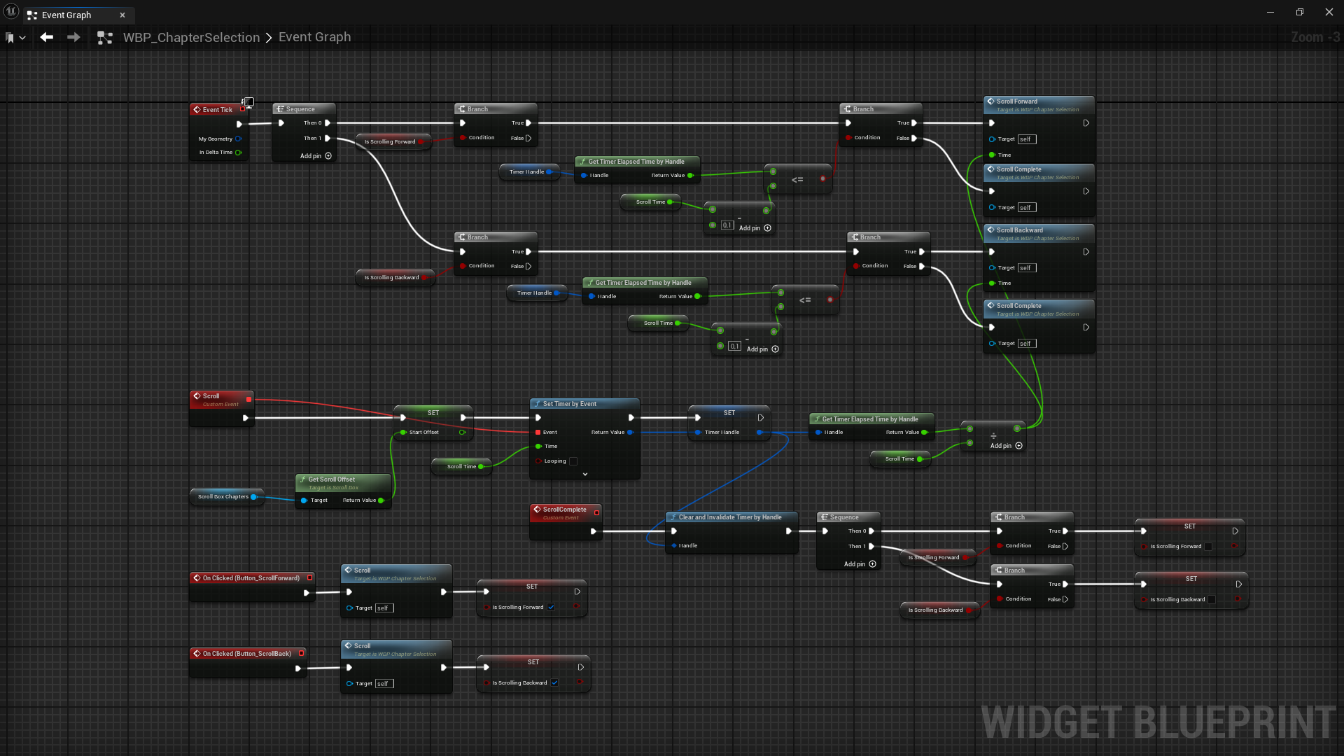
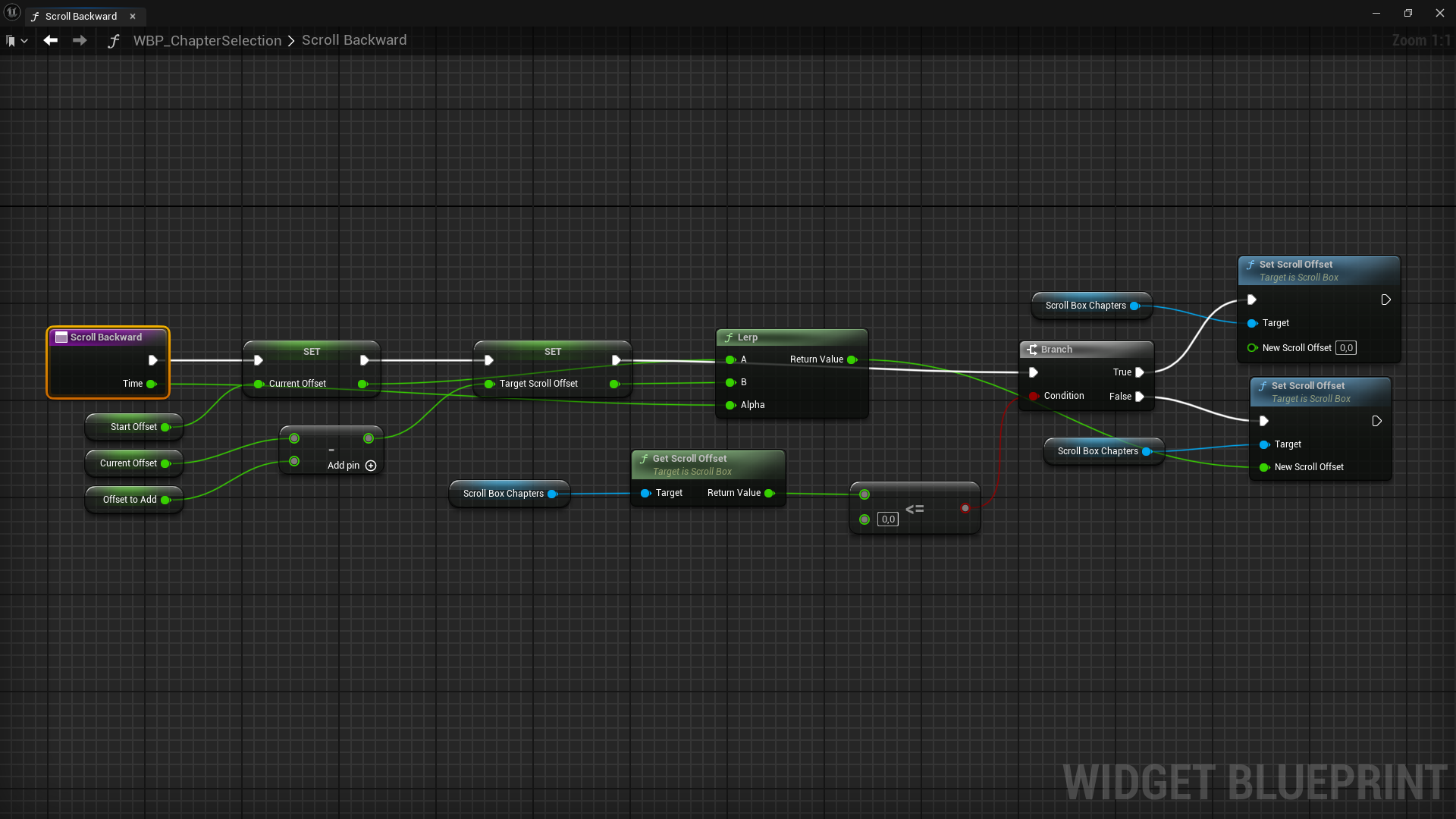
Blueprints
Mockups